Beauty & care
Gazfloria
A softer visual language for haircare.
Brand identitySocial media creative
The project
A softer visual language for haircare.
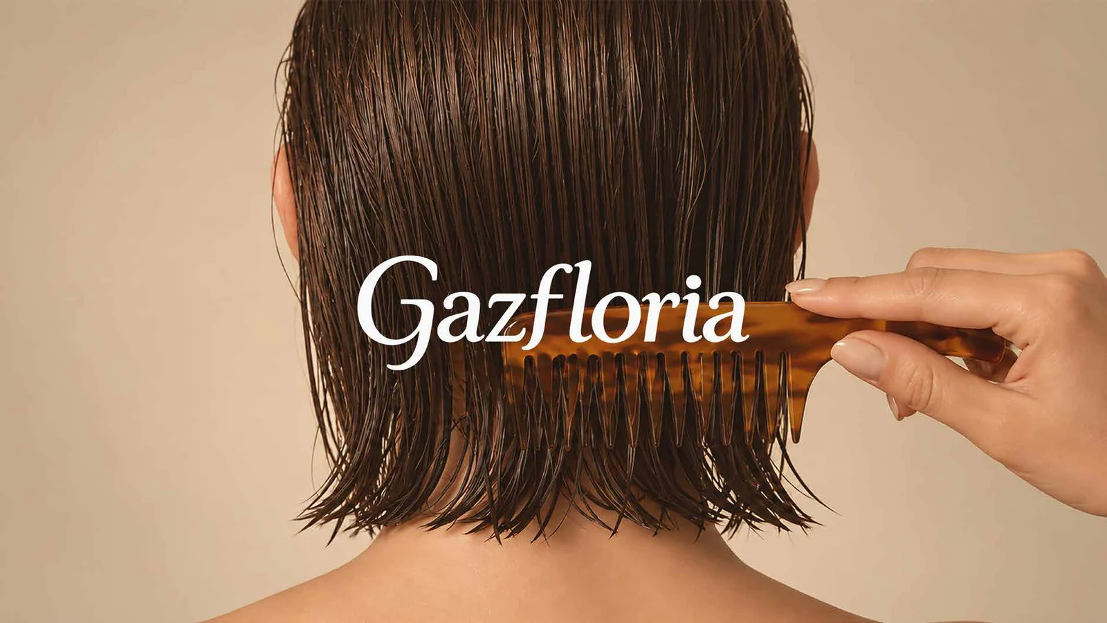
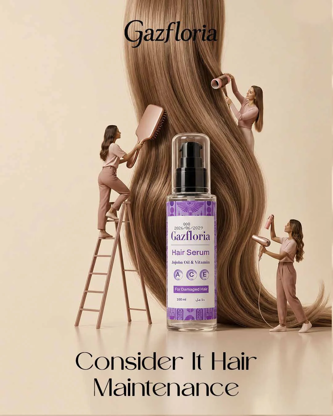
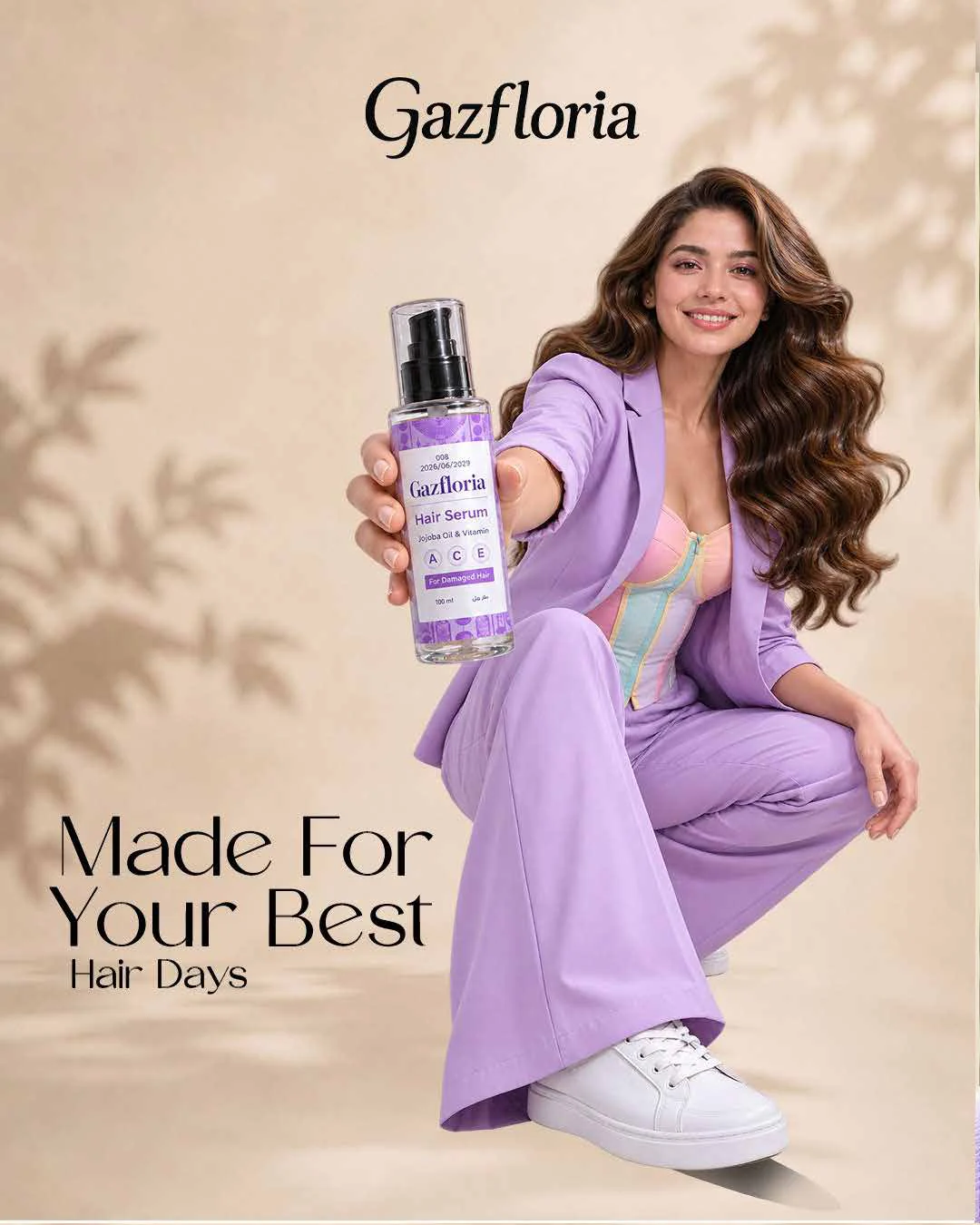
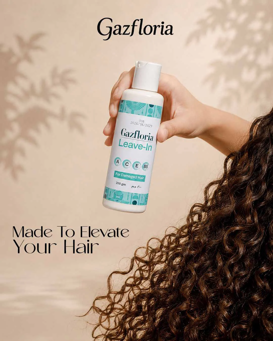
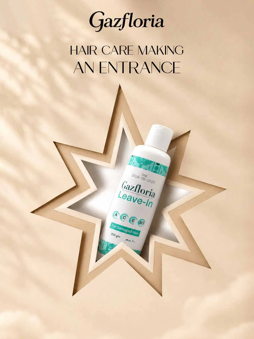
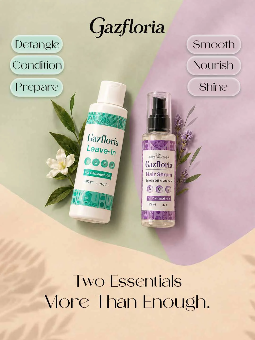
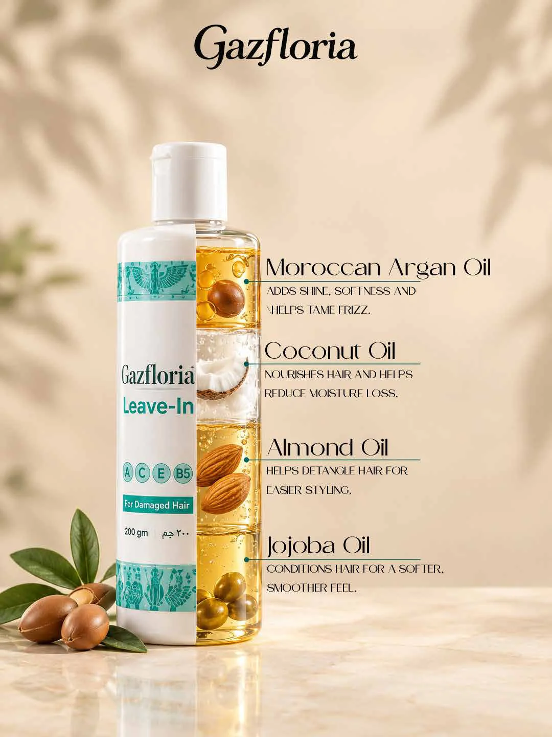
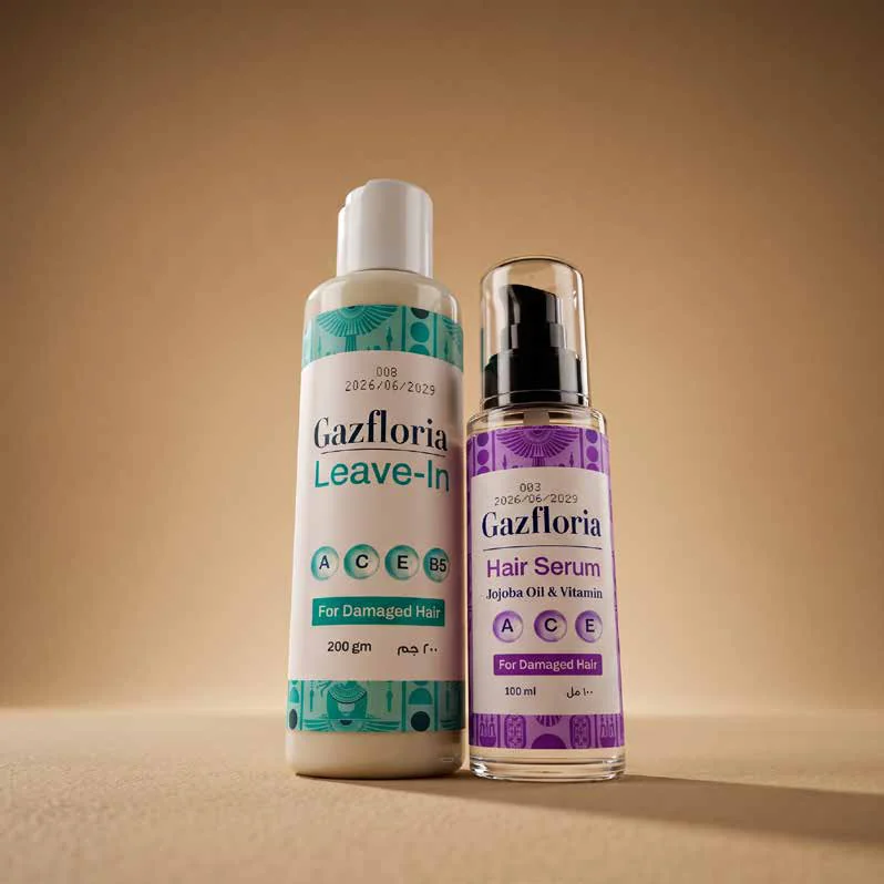
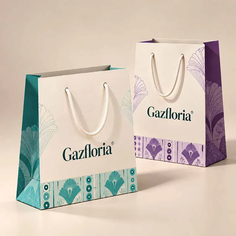
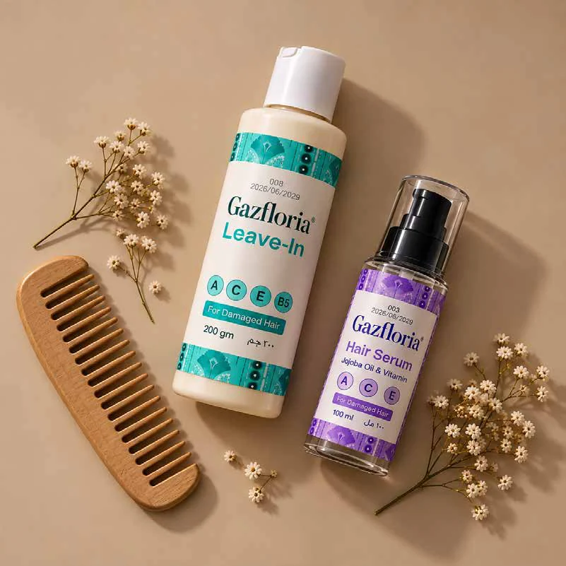
Gazfloria combines a delicate wordmark with haircare labels and shopping bags. The social collection places the bottles in warm beige settings alongside hair, botanical details and lilac accents.
Visual direction
Products with room to breathe.
Restrained typography, soft shadows and a cream base keep attention on the packaging, with turquoise and purple distinguishing the product range.
The work
A closer look.
Identity, detail and everything in between.
The execution
From identity to expression.
- Brand identity
- Social media creative
More perspectives.
Next project
Slip & Go
Explore project
Your brand. Our next collaboration.
Start your project